Tables are essential for organizing and displaying large datasets on websites, helping visitors compare products, check prices, and view schedules. Desktop screens benefit from tables, yet these same formats result in major headaches on mobile devices. As a consequence, it becomes hard for users to read or interact with them.
So, how can you fix this? Your tables need responsiveness as a solution. A responsive table adapts its size and layout based on the current screen layout.
In this guide, we’ll show you exactly how to make a responsive table in WordPress. The methods in this blog produce tables that are presentable and deliver intuitive usability across all screen sizes.
Do you want to make your website more user-friendly? Then, let’s get started!
What Are Responsive Tables?
Standard tables often become messy and unreadable on small screens like phones and tablets. They remain messy and hard to read. Just like responsive web design, tables should also adjust to different screen sizes. Responsive tables can adjust to any screen size, so they look good.
A responsive table uses rules to change its layout based on the screen size. For example, if someone views your table on a small screen, it might add a scroll bar or stack the rows neatly.
Instead of cramming data into tiny spaces, responsive tables make information easier to read. So, they look great and work well, no matter the device.
Why Are Responsive WordPress Tables Important?
Responsive tables enhance your WordPress site’s readability and usability on all devices, big or small. Without them, users might have to scroll sideways, making the experience frustrating.
A non-responsive table can break your website’s layout and harm its design. Responsive tables solve this problem by adjusting to the screen size. Therefore, it becomes easy to read tables from any device.
What’s more, responsive tables fit nicely into layouts made with page builders like Elementor, Divi, Thrive Architect, or landing page plugins. By reformatting instead of cramming data, responsive tables keep WordPress websites user-friendly and professional.
So, if you are running a website on WordPress, make sure the tables are responsive. Otherwise, readers will have a hard time reading website content.
How to Create a Responsive Table Manually Without a Plugin?
A common question among WordPress users is, “How to make a responsive table in WordPress?” If you prefer not to use a plugin, you can manually create a responsive table in WordPress using HTML and CSS. Here’s how:
Step 1: Format Your Table for Responsive Design
Reformatting the table’s data at a particular breakpoint is an excellent strategy. When you scroll horizontally, you’re frequently looking at data from a column out of context.
In certain situations, adding a scroll bar to tables is enough. However, it is better to organize the table’s data so that it displays in a more readable manner and does not require horizontal scrolling.
You have to first verify that your table is formatted correctly to improve the functionality of this table. To ensure that your CSS will function correctly, you can create the table in the WordPress Block Editor. After that, add <thead> for column headers and <tbody> for table data. This helps CSS understand which parts are headers and which are content. The HTML editor can be used to modify the table’s formatting after it has been added.
Step 2: Add Custom CSS Code
If you are using the latest WordPress theme, go to Appearance > Customize > Additional CSS in WordPress. Paste the following custom code:
| @media screen and (max-width: 800px) { table {width: 100%;} thead {display: none;} tr:nth-of-type(2n) {background-color: inherit;} tbody td {display: block; text-align: center;} tr td:first-child {background: #f0f0f0; font-weight: bold; font-size: 1.5em;} tbody td:before { content: attr(data-th); display: block; text-align: center; }} |
This CSS code hides column headers and rearranges data for smaller screens.
Step 3: Test the Table
Use WordPress’s built-in preview to test the table on mobile, tablet, and desktop. In the previous step, we already made a WordPress table with all the HTML characteristics required to operate with the CSS. All you need to do is modify the CSS breakpoint (in this case, 800px) to suit your requirements.
The CSS revamps the data into a responsive format rather than squishing it or adding a scrollbar.
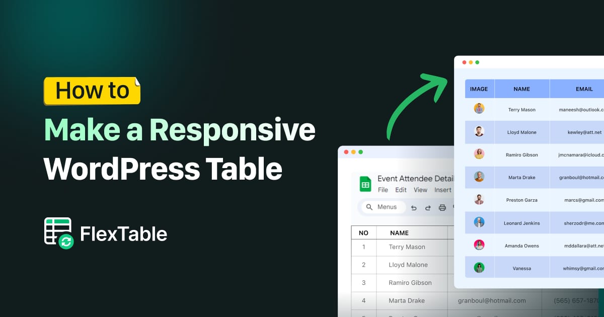
Let’s Get to Know About FlexTable
FlexTable is a practical WordPress plugin for table building. It simplifies the overall process of table creation. How? It syncs data between Google Sheets and your WordPress site. Therefore, you can display live data from your spreadsheets on your site. Any update you make in Google Sheets is automatically reflected—without any manual intervention.
What’s more, FlexTable is compatible with Elementor and Gutenberg. This gives you full control over table design and functionality. You can easily customize tables—no coding required.
The tables created with FlexTable are fully responsive, ensuring they look great on all devices.
FlexTable goes beyond just syncing data—it’s designed to make your website more dynamic and user-friendly. There’s also no need for technical expertise; everything is intuitive and beginner-friendly.
Key Features of FlexTable
This plugin is packed with powerful features. It supports live data synchronization, meaning your WordPress tables always stay up-to-date and visually appealing. FlexTable got you covered when you need to create responsive tables or export data in different formats.
Let’s take a closer look at what FlexTable offers and learn why it is a great tool for managing tables on your WordPress site:
- Live Data Sync: Automatically updates your WordPress tables with changes made to Google Sheets.
- Customizable Designs: With built-in support for customization, you can modify headers, body styles, and borders effortlessly.
- Responsive Tables: Displays your tables perfectly on any device, from phones to desktops.
- Image Support: Upload images in your tables by importing them from Google Sheets using image URLs.
- Merged Cells: Combines cells in tables to improve organization and clarity.
- Export Options: Download tables in CSV, Excel, PDF, or JSON formats with just a click.
- Built-in Pagination: Merge or split large datasets into easy-to-navigate pages for better readability.
- Sorting and Filtering: Helps organize data in an efficient and user-friendly way.
- Caching Feature: Speeds up loading times by reducing server load, even with large tables.
- User-Friendly Interface: Easy to use, with no coding knowledge required.
- 24/7 Support: Dedicated support team available to assist with any issues.
How to Make a Responsive Table in WordPress Using FlexTable: The Easiest Way
Creating a responsive table with FlexTable is quick and straightforward. You just have to create a table on Google Sheets if you haven’t already.
With that said, if you have already created a table on Google Sheet, then the process will be a piece of cake. It will take a couple of minutes to create a responsive WordPress table.
Follow these steps to set up your first table and display it on your WordPress site:
Step 1: Install and Activate FlexTable
Go to your WordPress dashboard and click on Plugins > Add New.

Search for “FlexTable” in the search bar.

Click Install and then Activate to enable the plugin.


Step 2: Create a New Table
Navigate to the FlexTable Dashboard in your WordPress admin panel.
Click on “Create new table” to start building your table.
Open the desired Google Sheet and copy its URL link.

Paste the Google Sheets URL into the field provided on the FlexTable dashboard.
Press the “Create table” button to fetch and sync the data.

Step 3: Customize Your Table
On the next screen, give your table a title and description if you like to.

Pick a theme for your table and customize it to your liking.
Use the preview option to ensure it matches your desired design.
Once satisfied, click on Fetch & Save to finalize the table.
Step 4: Add the Table to Your Website
Create a new page from your WordPress dashboard or open an existing one.

Once you are on the page, create a new block and click on “Browse all.”

Select the “FlexTable” option from the menu.

You have the option to create a new table or choose an existing one. For now, we will select the “Choose Table” option since we have already made a table.

Select the table from the dropdown, and the table will appear on the page. Click the “Save” button to record your progress.

Alternatively, you can copy the table’s shortcode from the FlexTable dashboard.

Open the WordPress page or post where you want to display the table.
Click the + button, add a Shortcode Block, and paste the shortcode.

Once your table is ready, publish it, and FlexTable will keep it synced with your Google Sheet. Any updates to the sheet will appear on your site automatically, saving you time and effort.
Get hands-on experience on creating a responsive table in WordPress from this video:
If you use the paid version of FlexTable, you can adjust colors, fonts, layouts, and even merge cells to make your data more readable.
Step 5: Check for Responsiveness
The good news is that all the tables created with FlexTable will be responsive by default. Therefore, there is no additional work from your end to make them responsive.
You can check your table on a mobile and tab. You will see that the table automatically adjusts the screen size.

How FlexTable Can Make Your Life Easier?
By now, you might have understood the value of adding FlexTable to your WordPress site. This powerful tool simplifies how you manage and organize tables on your site. Plus, you can easily and quickly create responsive tables. Hence, your website looks great on any device.
With the following benefits of using FlexTable, your life will certainly become easier:
- Easy Table Creation: You can create tables without needing any coding skills.
- Automatic Syncing: Your table data updates automatically from Google Sheets.
- Customizable Design: FlexTable allows you to easily change colors, fonts, and layout.
- Time-Saving: Syncing data directly from Google Sheets saves you time on manual updates.
- Simple Shortcode Integration: Add tables to any page or post with a simple shortcode.
- User-Friendly Interface: You don’t need to be a tech expert to use FlexTable.
- Responsive Tables: Your tables will look perfect on mobile, tablet, and desktop screens.
- Improved Table Performance: Tables load quickly, which improves your website’s performance.
FAQs
How do I make a table mobile-friendly in WordPress?
Use responsive WordPress table plugins like FlexTable. These plugins adjust the table layout based on the screen size. Avoid fixed-width tables and make sure the table design fits smaller screens. You can also use CSS to make tables scrollable on mobile devices.
How do I create a dynamic table in WordPress?
To create a dynamic table, use TablePress, Elementor, or more advanced plugins like wpDataTables. By connecting the table to external data sources, these tools enable automatic table updates. After creating the table, you can embed it on your page using shortcodes or widgets.
How do I create a custom table in WordPress?
To create a custom table, you’ll need to use the $wpdb object in WordPress. This allows you to interact with the database. Define the table’s name and structure, then run a query to create it. This method requires some coding knowledge but offers full customization.
Final Thoughts
Mobile devices drive about 60% of traffic on websites. With mobile traffic on the rise, optimizing table design is no longer optional—it’s necessary for improving user experience and retaining visitors.
Complicated tables can prove irritating on mobile screens unless they receive proper design optimization. You need to learn how to make a responsive table in WordPress if you want your content to remain accessible for all screen sizes.
FlexTable can simplify and expedite the process of creating responsive tables in WordPress. It offers a hassle-free way to create beautifully designed tables that adapt fluidly between different screen resolutions. So, both desktop and mobile users enjoy a great experience when visiting your site.
If you’re looking for an easy solution, try FlexTable today and start creating responsive tables with ease!
Add your first comment to this post