
The early days of computing were all about dark backgrounds. It’s only with the advent of color monitors that bright screens became the norm, turning our digital world into a blindingly vibrant canvas.
Fast forward to today, and it’s like we’ve come full circle. Dark mode design is back with a vengeance, and it’s not just for the edgy tech crowd anymore. It’s everywhere – on our phones, within our favorite apps, and even on the websites we visit daily.
But why this sudden resurgence? Is it a mere tip of the hat to digital days gone by, or does the dark mode design harbor a deeper branding significance?
This blog will strip away the shadows to reveal the truth behind dark mode, layer by layer. We’ll dissect this trend’s skyrocketing street cred and weigh up the views from all corners of the opinion spectrum. So, are you ready to see what’s hiding in the dark? Let’s dive in!
Rise of Dark Mode Design
Dark mode, often dubbed ‘night mode’ or ‘lights-out mode,’ is an inversion of the traditional user interface palette. This mode, reminiscent of a photographic negative, cleverly swaps the script by presenting light text and elements on a dark backdrop.
Originally, Dark Mode wasn’t a ‘mode’ at all; it was the only mode. The cathode-ray tube screens of yesteryears naturally glowed with green text on black backgrounds, a look that screams ‘retro’ today.

But then, as computers shuffled out of the basements and into the bright light of mainstream society, interfaces morphed to mimic paper – a familiar and non-intimidating surface for the everyday user. So, we waved goodbye to the dark interfaces of old and embraced the bright, paper-like screens that dominated the digital landscape for decades.
However, in the past few years, we’ve seen a massive U-turn in design philosophy. As though pulled by some unseen gravitational force, the design world has been lured back into the comforting embrace of dark mode.
Why does this return to the dark side, you might wonder? There’s a method to this moody madness. Dark mode isn’t just turning down the lights; it’s strategically playing with contrasts and colors to create a visual experience that’s not just easy on the eyes but also incredibly captivating, as we’ll see in the following sections.
The Practical Perks of Going Dark
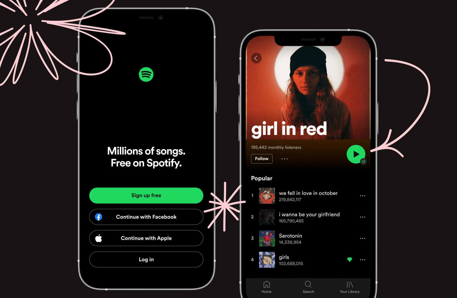
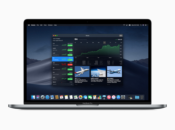
From the hallowed halls of Silicon Valley to the cozy corners of small-town coffee shops, the buzz around dark mode is growing louder by the day. Apple, Google, Spotify – all the big players are on board with this trend. But why? What’s in it for them, and more importantly, what’s in it for you? Let’s begin by shedding some light on the practical benefits brewing underneath the dark mode interface.
Enhanced Visual Comfort
While science is still catching up in providing concrete evidence, many users swear by the comfort dark mode brings to our beleaguered peepers. This is because dark mode designs swap the retina-searing brightness of traditional layouts for a more subdued, darker palette, making it less taxing on the eyes.
This shift is particularly beneficial during late-night scrolling sessions or in dimly lit environments, where a bright screen can feel like staring into a lighthouse beacon. Plus, the reduced glare means fewer headaches and more enjoyable late-night binge-watching marathons.
Minimized Blue Light Exposure
As night falls, our brains naturally ramp up melatonin production, the sleepy-time chemical. But exposure to light, especially the type emitted by our screens, can throw a wrench into this natural cycle. Blue light, in particular, is notorious for its melatonin-suppressing antics, more so than other types of light, according to Harvard’s research.
So, what does this have to do with dark mode, you ask? By dialing down the blue light, dark mode offers a more sleep-friendly alternative for those inevitable pre-bedtime scrolls. While it’s best to avoid screens altogether before hitting the hay, if you must indulge in some late-night digital interaction, the dark mode could be your lesser evil, ensuring your sleep cycle doesn’t go completely off the rails.
Optimized Battery Efficiency
In a study by Purdue University, researchers revealed that switching from light mode to dark mode at 100% brightness can save a significant chunk of battery power. The catch? This power-saving trick primarily benefits the newer OLED (organic light-emitting diode) display-based smartphones, not their older LCD (liquid crystal display) siblings. This is because, unlike the latter, which relies on an external backlight for illuminating pixels, each pixel in an OLED display is individually lit. So, when pixels are black or dark, they’re essentially turned off, sipping less power than their brightly lit counterparts.
However, if you’re not cranking your screen brightness to the max, the energy savings become less dramatic. At full throttle (100% brightness), the leap from light to dark mode can reduce power consumption by about 42%. But if you’re more of a mid-range brightness person, say 50%, the savings drop to a modest 8.5%. At a more dimly lit 30% brightness, the energy conservation is a mere under 5%. So, unless you’re the type who enjoys a brightly lit phone, dark mode’s battery-saving prowess might not be as monumental as you’d expect.
Dark Mode as a Branding Power Move
Dark mode design has swiftly evolved from a simple interface choice to a powerful branding tool. Here’s why savvy marketers are turning to the dark side to make their brands shine:
Enhancing Brand Identity
Dark mode can amplify a brand’s identity, especially when juxtaposed with vibrant color palettes. It provides a dramatic backdrop against which colors pop and designs dazzle. Brands like Spotify and Netflix use dark mode effectively to make their videos and graphics leap off the screen, embedding their brand imagery more firmly in the user’s mind.
Standing Out in a Sea of Sameness
In a world where every website and app seems to blend into one continuous scroll of white backgrounds, dark mode is your chance to break the mold. It’s bold, it’s different, and it demands attention. Brands that adopt dark mode carve out an immersive, standout presence within the saturated online realm, bestowing upon themselves a singular visual signature.
Evoking Emotion and Elegance
Dark mode conveys a range of emotions and associations – sophistication, mystery, luxury, and minimalism. It’s no coincidence that high-end brands often employ dark backgrounds in their presentations and marketing to communicate an air of premium quality. For brands aiming to create a sense of exclusivity or high-end appeal, dark mode can be the perfect attire to make a bold statement.
Navigating the Dark Mode Minefield
Despite its growing popularity and apparent benefits, Dark Mode isn’t without its critics. Some argue that it can make certain design elements less discernible, potentially impacting usability. Others point out that reading white text on a dark background can cause what’s known as the “halation effect” for some users, especially those with astigmatism, where the light text appears to bleed into the dark background, making it harder to read.
Then there’s the question of aesthetics. While dark mode can look incredibly sleek and modern, it’s not a one-size-fits-all solution. It can sometimes swallow up certain colors, making them appear dull or washed out. And that harsh contrast? It can be downright jarring for those who prefer the more traditional interfaces. Plus, it might not always align with a brand’s vibe, causing a visual disconnect.
However, the most significant challenge lies in the practical implementation of dark mode. It’s not just a matter of flipping a switch and turning everything dark. A well-executed dark mode requires careful consideration of contrast ratios, color saturation, and typographic adjustments to ensure readability and visual comfort. It’s a delicate balancing act that, if mishandled, can lead to a user experience that’s more frustrating than fashionable.
Implementing the Dark Mode Design
So, how do you hop onto the dark mode bandwagon without falling off or looking like you’ve just slapped a gothic filter over your digital presence? Here are clever tips and tricks to ensure your dark mode design hits the sweet spot between style and substance:
Consider Your Audience
Before you plunge into the dark, consider your users. Are they night owls who crave the low-light comfort of dark mode? Or are they traditionalists who might find a sudden switch to darkness disorienting? Understanding your audience’s preferences and behaviors is crucial in deciding whether dark mode aligns with their expectations.
Subdue the Saturated Colors
Colors behave differently on dark backgrounds. Those saturated beauties that once stole the show can quickly turn into overpowering divas, disrupting the delicate visual hierarchy. So, when you embark on your quest for the perfect dark mode palette, lean toward the less saturated iterations of your brand colors. This way, your UI elements will shine without overshadowing the grand design.
Offer an Easy Toggle Option
Forcing a single aesthetic down everyone’s throats won’t win you any popularity contests. So, give your users the choice. Implement a user-friendly toggle switch that allows users to switch between light and dark modes based on their preferences. This way, users hold the reins, choosing what suits their eyes and mood. A simple switch can make a world of difference in user satisfaction and retention.
Don the Tools of the Trade
The spectrum of tools required for effective dark mode implementation is as varied as it is vital. From design-specific software that helps you nail the perfect shade of dark to administrative tools ensuring that your back end stays as sleek as your front, the toolset is expansive. For those looking to dip their toes in these shadowy waters, a good starting point is exploring curated design and management tool lists specifically for design agencies. These compilations offer a glimpse into the plethora of options available, helping you understand the scope and depth of what you’re diving into.
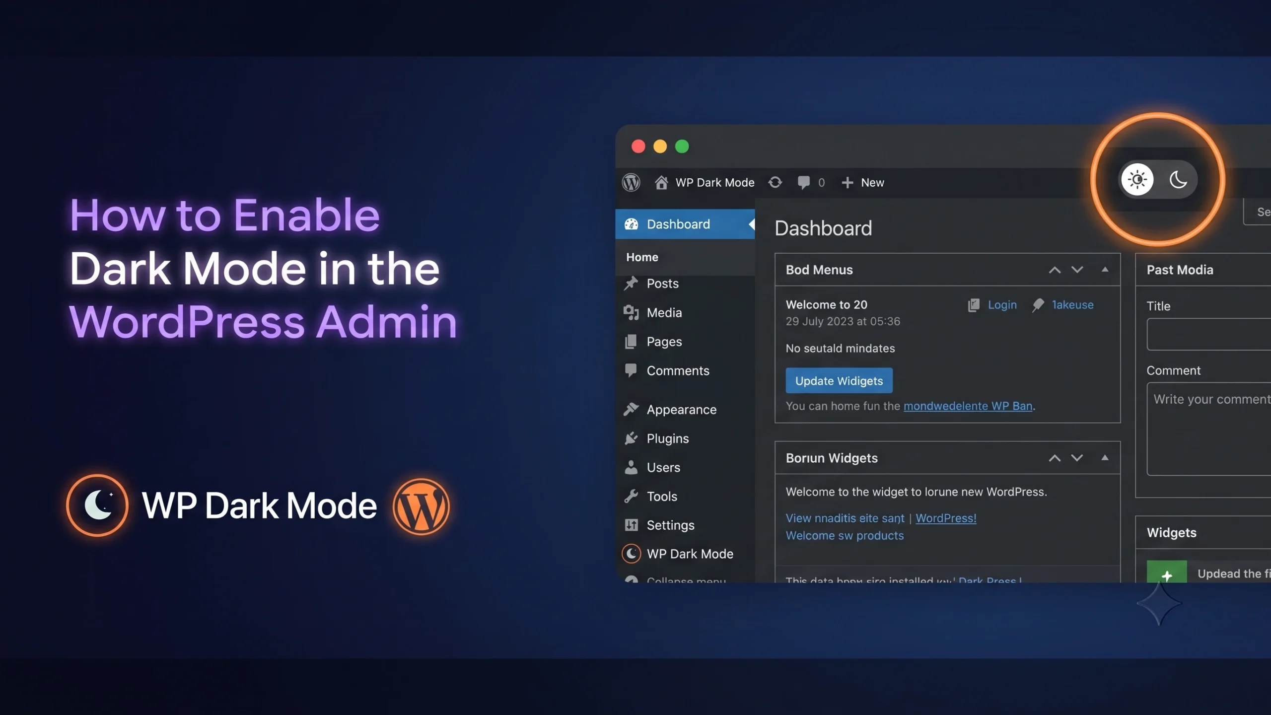
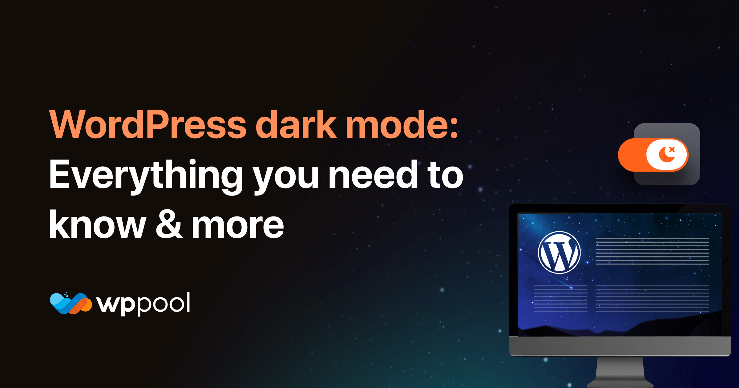
Utilize a Dark Mode Plugin
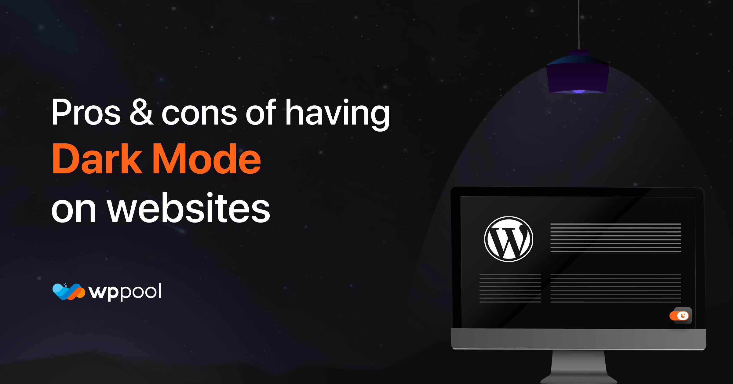
Using a plugin can simplify your journey into the dark. It offers a tested framework, ensuring that you don’t stumble over common pitfalls like poor contrast or readability issues. For WordPress users, the WP Dark Mode plugin is a shining example. It effortlessly converts your site into a dark mode haven, offering a user-friendly interface and customizable settings to align with your brand aesthetics. Opting for a plugin over DIY can save you time, resources, and potential headaches. Plus, it’s like having a seasoned guide leading you through uncharted territories.
Test the Waters
Don’t go all-in blindly. Conduct A/B testing to see how your users react to the change. You have a couple of options here. You can employ designated A/B testing tools, or for a more budget-friendly approach, create QR codes to direct users to different versions of your website – one in light mode and one in dark mode. Then, analyze the data to see which version garners more engagement and positive feedback. This way, you’re not just taking a wild stab in the dark (pun intended). You’re making informed decisions rooted in user behavior and preferences.
Turning to the Dark Side
Dark mode design is a subtle rebellion against the bright and the brash and a nod to a future where comfort and style go hand in hand. And by implementing it thoughtfully, you can leverage this UI to create a distinctive, user-friendly, and visually elevated brand presence.
So, don’t be afraid to step into the dark—you might just find what you’ve been looking for.
Add your first comment to this post