According to the World Health Organization, an estimated 1.3 billion people, which is almost 16% of the world’s population experience some kind of disability.
That’s a huge amount of people to think about and some of your users could be a part of this population. So if you don’t want to miss out on such a large audience, it is crucial to make sure your site provides a good user experience for everyone.
Additional accessibility features on your website are a great way to show you care about your users. These features help you provide a smooth user experience for all kinds of users on your site.
Now let’s talk about how you can make your site more accessible for all kinds of people.
What is WordPress Accessibility
Accessibility is all about removing barriers that prevent people from accessing and engaging with information, services, or environments.
WordPress accessibility refers to the practice of making WordPress websites usable for all users, regardless of their skills or limitations. This means making sure that viewers of your website who are visually impaired, have problems with hearing, are movement impaired, are cognitively impaired, or have other disabilities can access and comprehend the content and functions.
Not only does accessibility help persons with impairments, but it also helps others with situational constraints like sluggish internet or assistive technology use. It’s about thoughtful planning that takes into account a range of needs and enables everyone to have a complete experience of their surroundings.
10 WordPress accessibility tips
Here are 10 WordPress accessibility tips you can follow to make your site accessible for your potential audience that suffers from some kind of disability:
Use an accessible WordPress theme for your site
A website’s theme serves as the cornerstone of its accessibility. Ensure that the WordPress theme you select is accessible. Seek themes compliant with the Web Content Accessibility Guidelines (WCAG) guidelines. The built-in features of these themes frequently facilitate the navigation of your website for individuals with impairments.
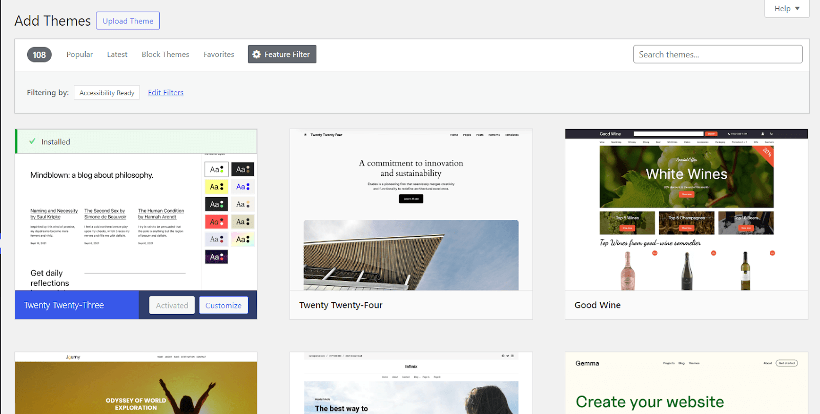
There are currently 100+ themes in WordPress that are accessibility ready. Try to choose a theme for your website from them. Look for themes with high contrast, good keyboard navigation, and other easy-to-access features.
Use proper headings
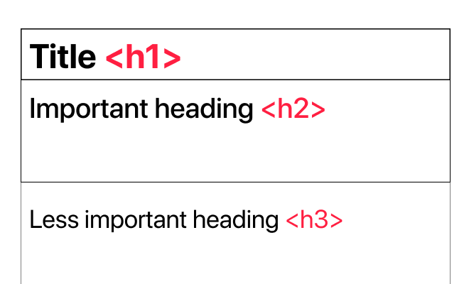
Use appropriate header tags (H1, H2, H3, etc.) to arrange your text on the website. This makes the materials on the website easier to read and make it more organized.
In addition to that, heading tags also make it easier for screen readers to figure out the order of information on your website. So, it becomes easier to navigate through your content in proper order thus helping you to convey your message correctly.
Also, Make sure the material behind your headers is appropriately represented.
Provide Alt Text for images
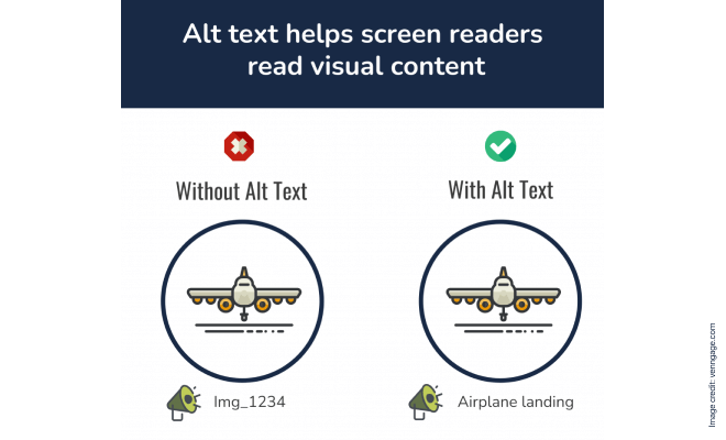
Whenever you add an image to your WordPress website, make sure to add an alt text for it. Try to make the alt text with short but proper words that correctly describe the image.
For those who use screen readers and have visual impairments, alt text is crucial. Also, if your site’s audience is from a certain demographic that might not always have access to high-speed internet, this alt text could help a lot to understand the content better.
So, it is also important that this description should be brief and provide a meaningful experience for all viewers by summarizing the image’s substance or goal.
Use descriptive link text
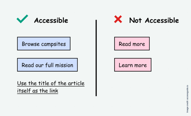
Descriptive links help users with screen readers or other assistive devices comprehend the purpose of the link by giving clear and useful information about the destination. By making it easier for those with cognitive disabilities or vision impairments to browse the website, this approach improves the user experience overall.
In addition to making the material more accessible, descriptive link language helps create an online environment that is inclusive of all users, regardless of ability, by making the information on the website easy to understand and engage with.
Think about your website’s color contrast
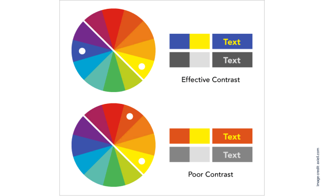
The color contrast of your website should be carefully considered if you want to increase accessibility. Making sure there is enough contrast between the background and text colors improves readability, which is advantageous for users who have vision problems or have trouble distinguishing particular color schemes.
For a website to be inclusive of all users, color contrast ratios must be created per the Web Content Accessibility Guidelines (WCAG). This approach helps those with visual impairments as well as making the internet a more user-friendly and accessible place for everybody.
Lots of people now prefer using dark mode for comfort. So, consider using WordPress accessibility plugins like WP Dark Mode to cater to those audiences.
Light or dark, which mode in use, make sure the colors are contrasted enough so that contents are easily visible. There are many online tools to check color contrast levels. You can use those to check if the two colors are going together well in the sense of contrast. Setting color contrast as a top priority shows a dedication to improving digital content’s readability and navigability for people with varying abilities.
Utilize keyboard navigation
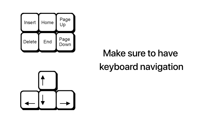
Giving keyboard navigation a priority greatly improves the accessibility of websites. Many people use keyboards to access the web, including those with mobility impairments or conditions that prevent them from using a mouse or mobility device. By including keyboard-friendly elements in the design of websites, all capabilities are available without the need for a mouse.
Users with motor limitations benefit from this approach, which also makes the internet a more accessible place. Websites that prioritize keyboard navigation become more accessible to a wider range of users, conforming to online accessibility guidelines and fostering an atmosphere in which all users can easily browse, interact, and engage with digital information.
Implement ARIA (Accessible Rich Internet Applications) roles
Improving the accessibility of websites requires implementing roles for Accessible Rich Internet Applications (ARIA). With the use of a collection of properties called ARIA, persons with impairments may better comprehend dynamic and interactive content by adding extra information to HTML elements.
WordPress allows you to implement ARIA roles to improve the experience for users of assistive technologies. Use roles such as “button,” “menu,” or “navigation” appropriately. By incorporating ARIA roles, web developers can improve the accessibility of complex web applications, ensuring that screen readers and other assistive tools accurately interpret and communicate the purpose and behavior of various interface elements.
This promotes a user-friendly and universally accessible online environment, in keeping with best practices in web accessibility, and not just makes it easier for people with impairments to engage with technology.
Optimize forms for accessibility
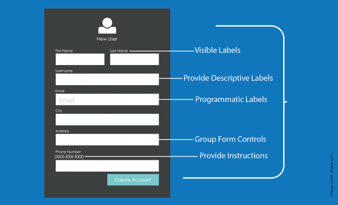
Forms are essential to user engagement, and websites could be made more accessible to people with disabilities by putting accessibility standards into effect, such as labeling forms clearly, making sure tab orders make sense, and providing concise error messages.
This method helps people fill out forms quickly, especially those who use screen readers or have cognitive disabilities.
Furthermore, including features such as autocomplete characteristics and appropriate form validation makes things easier for everyone and reaffirms the dedication to producing digital material that is accessible to a wide spectrum of consumers.
In WordPress, try to choose minimal and easy-to-understand form-related plugins like FormyChat and others, to collect information and interact with all kinds of audiences.
Work on video accessibility
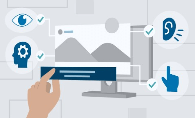
If your website contains videos, provide accurate transcripts and captions for those videos to make them accessible. This will help those who are unable to hear well or who are in noisy situations understand the material.
For visually impaired users, include audio explanations in addition to visual components. When writing video scripts, use plain language to help those with cognitive impairments.
For convenience of use, pick a player that accepts keyboard inputs. By putting these strategies into effect, websites may better accommodate a wide range of users, adhere to online accessibility guidelines, and provide a space where users of all abilities can interact and enjoy multimedia content.
Regularly test your website
It’s important to regularly assess the accessibility of your website. Assess the accessibility of your website with browser extensions, screen readers, and online tools.
Testing often enables you to find and fix any new accessibility problems that could appear when you update and change your content.
How to test your WordPress accessibility
Testing the website’s accessibility every now and then is crucial. It helps you to understand how your users are finding your site. You can find issues on your site with these tests. From resolving issues it can drastically improve the user experience of your site.
There are several ways to test your website accessibility.
Manual testing
To test navigation accessibility, use simply a keyboard to surf through your website. Make sure that all forms, menus, and interactive features can be accessed without the need for a mouse.
Use screen reader software and record while surfing through your site. Then verify that the features and information are clear and simple to use by watching those records afterwards. This helps you to see your site from a user’s perspective and helps you to know about any difficulties that can arise on your site.
Also, test the site in different environments. Like, access your site with public and private wifi. Surf of low-speed internet. Surf the site from a mobile device and see if your site faces any difficulties on smaller devices. Also, make sure your site is also easy to read and understand in dark mode settings too. As dark modes are getting increasingly popular, a load of people can visit your site with dark mode on.
Check the alt text in your site from the user’s perspective. Make sure there is alt text for all the images and the text is meaningful and accurately describes the image.
Lastly, test your site from different user’s perspectives. Like if someone is colorblind, if someone has a vision problem how would they see your site from their side?
Automated tests
Some tools can help you to check the accessibility of your site. WAVE is such a free tool you can use to test your website. This tool can help you to identify Web Content Accessibility Guideline (WCAG) errors in your site and help you to point out those errors.
You can also use some small tools like color contrast checkers and others that are available online to check your individual accessibility feature and find out if your website needs any improvements.
Conclusion
By implementing these WordPress accessibility tips, you can create a website that is welcoming and inclusive to users of all abilities. It’s worth it to invest your time to find the perfect accessibility plugin for your WordPress site to cater to a broader audience.
Making accessibility a top priority guarantees that your material is seen by as many people as possible while also being in line with ethical web development principles. It’s critical to keep up with technological developments and make a concerted effort to ensure that everyone can access the digital world.
FAQ
Q: Why is WordPress accessibility important?
A: To make sure that users of all abilities can access your digital content and services, your WordPress website must be accessible. For people with disabilities, such as those who have visual, hearing, motor, or cognitive limitations, it improves the user experience. Building an accessible website expands your reach and audience as well as encourages diversity.
Q: What are ARIA roles, and why are they important?
A: The accessibility of dynamic and interactive features on your website is improved by ARIA (Accessible Rich Internet Applications) roles. Your website becomes more inclusive when you implement ARIA roles correctly, which enhances the user experience for those who need assistive technology.
Q: How to improve my website’s accessibility?
A: To improve your website’s accessibility, focus on key areas:
- Use an accessible theme for your site
- Use appropriate header tags (H1, H2, H3, etc.) to arrange your text on the website
- Provide Alt Text for images
- Use descriptive link text
- Give importance to your website’s color contrast
- Utilize keyboard navigation
- Implement ARIA (Accessible Rich Internet Applications) Roles
- Optimize Forms for Accessibility
- Regularly test your website



Add your first comment to this post