Whether it’s fashion or tech, trends change every year. Every day as new technologies are getting introduced into our daily life, our preferences are changing. This concept is valid for web design as well. Therefore, it’s always crucial to stay one step ahead when it comes to keeping up with the latest design trends.
So today let’s talk about what would be the best practices in web design for a higher conversion rate for your website in this ever-changing taste of people.
The importance of first impressions in web design
When a visitor comes to your website What’s the very first thing they notice? Or we can say it another way. The elements that attract the visitors most are Animations, graphics, color selection, and logo – all these things create a great first impression of your website and this certainly helps the visitor decide if they want to stay at the website or leave it.
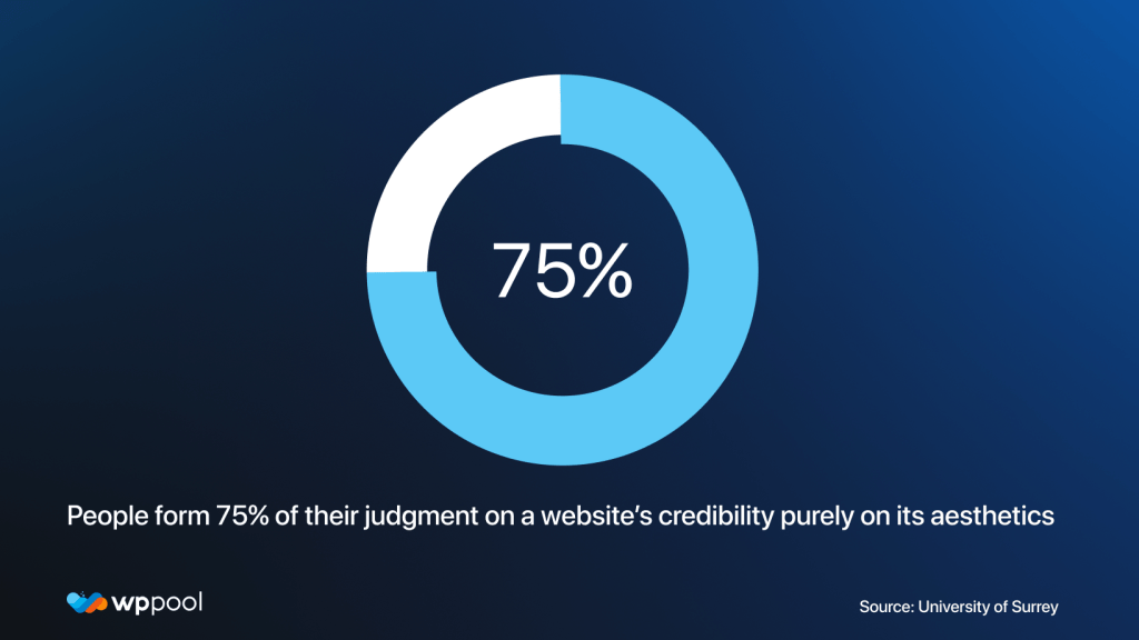
According to a study done by the University Of Surrey, people form 75% of their judgment on a website’s credibility purely on its aesthetics. That is why it’s very very important that your design looks professional and amazing.

Best practices in web design
Here are 7 of the best practices you can follow to hook your visitors to your site to achieve a higher conversion rate.
1. Apply the 8-Second Rule
If you know the general rule of thumb is that you only have 8 seconds to get a visitor’s attention. Because that is the length of the human attention span. Do you know, it’s shorter than the attention span of a goldfish!
Therefore you can realize you only have a very tiny window of opportunity to engage with the user when they first land on your site. You need to make those seconds count!
Here are some tips for grabbing attention and boosting conversions within the first 8 seconds:
- You need to use a large, benefit-driven headline that is brief and to the point.
- Eye-catching imagery that gives the message of the main point of your page and draws the eye toward your main call to action.
- Don’t forget to make signup buttons large, simple, and clear.
2. Simplicity will always be among the best practices in web design
Keeping simplicity while designing your website helps your target audience to understand your message easily. If there is too much going on on a website, the audience can get confused and leave the site without properly navigating through the features of the site. 88% of consumers are less likely to return to your site if they have difficulties or bad experiences with it. So, minimalistic web design is important to make it easy for the average user to understand where to look.
Here are some tips for keeping your website simple:
- Limit your menu from five to seven items
- Think and rethink about using too many colors on your website. Choose a minimalistic color theme that suits your brand.
- Reconsider overflowing your sidebars with too many ads or banners
- Use bullet points to convey your messages minimally
Simplicity never goes out of trend. So, keeping it simple is one of the best practices in web design you should follow.
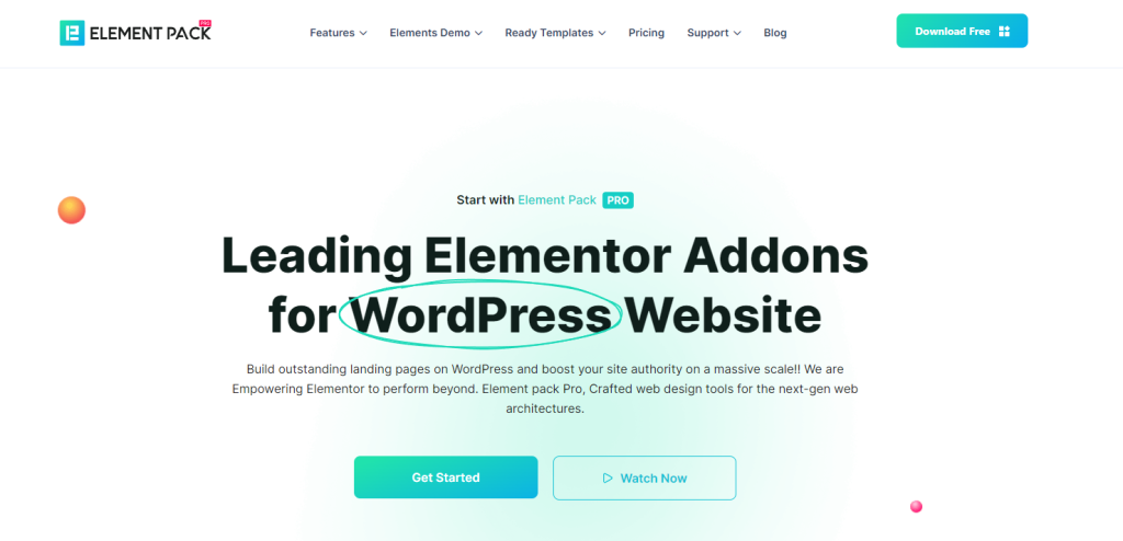
Bonus: If you are planning to build your dream website in Elementor WordPresss, then Element Pack can be your best choice. You can design any type of websites like Blogging, fitness, finance, Charity, and Woocommerce with its 240+ widgets and 2000+ ready templates. It’s your time to create websites that convert well.

3. Use dark mode
Dark mode has now become almost a basic practice in web design. As people are spending more and more time in front of screens, they started adopting dark modes for reduced eye strain and other benefits. It’s turning increasingly popular now that more scientific evidence is emerging on the harms of blue light.
Dark mode can easily be customized to your device based on the period of the day. You may use it to reduce eye strain and extend battery life.
The dark mode is also believed to reduce bounce rate and retain users on your site for a longer time. There are very few e-commerce sites that feature a dark mode toggle, so this is your golden chance to get ahead of a trend.
If you are using WordPress, then you are in luck. Because there are extraordinary plugins like WP Dark Mode to help you create the best dark theme for your website.
4. Add multistep forms
If your website requires filling out a form in some way do that in multistep. People right now hate long forms. Visitors tend to leave your site or stop surfing if they came across a long list of things that are required to fill. Most people take it as a hassle.
Instead breaking those forms into multi-steps is among the best practices in web design to be considered implementing while designing your website.
More and more industry leaders are planning to invest and work on multistep forms. Multi-step forms will create the threatening parameter of lengthy forms and improve engagement with the help of touch gestures. With micro-interactions while reducing typing and delivering a more rich experience to users than ever before.
People get less bored while filling up small but multiple forms which helps visitor retention.
5. Ensure better communication systems

Chatbots have been around for a long time, and their AI has become extremely advanced in 2023. Chatbots are a great way to answer your customers’ questions and help them find what they’re looking for.
Some of the benefits of chatbots are:
- These are very cheap
- 24/7 availability for customers
- A personalized experience for your site’s users
- They have huge potential for lowering customer acquisition costs.
6. Optimize your website for mobile
Optimizing for mobile is considered among the best practices in web design for lots of reasons. First and foremost, mobile devices are increasingly becoming the primary means of accessing the internet. In fact, more than half of all internet traffic comes from mobile devices. This means that if your website is not optimized for mobile, you risk losing a significant portion of your potential audience.
Because today’s world is full of options and mobile users are five times more likely to leave your site if it isn’t optimized for their device.
Moreover, mobile optimization can improve your website’s overall user experience. Mobile devices have smaller screens and different navigation methods than desktops, so a mobile-optimized site takes into account these differences and makes it easier for users to navigate and consume content.
A mobile-friendly site also tends to load faster and be more responsive, which can lead to increased engagement and reduced bounce rates.
From a search engine optimization (SEO) perspective, mobile optimization is also critical. Google’s search algorithm prioritizes mobile-friendly sites in its search results, meaning that if your site isn’t optimized for mobile, you could be missing out on valuable traffic.
Overall, optimizing for mobile is a crucial best practice in web design that can improve user experience, increase engagement, reduce bounce rates, and ultimately lead to greater success for your website.
7. Use a CTA button if required
Depending on what you want from your website, CTA (call-to-action) button could be among the best practices in web design you should follow. Whether it is to make a purchase, sign up for a newsletter, or request a quote, a well-designed CTA button can guide users toward completing a desired action.
But make sure to not overdo it. Make them easily noticeable with contrasting colors, using clear and concise language, and placing them prominently on the page.
By using a CTA button, web designers can improve the user experience, increase conversion rates, and ultimately achieve their business goals placing it among the best practices in web design. So, consider using CTA buttons for a higher conversion rate.
Conclusion
As technology and the web design industry continue to evolve and grow every day, we can expect more and more trends that will dominate the web design industry. However, the above best practices in web design are expected to remain in trend for 2023 and beyond.
And as you now know about these best practices in web design, apply them and also increase your conversion rate drastically!


Add your first comment to this post