Dark mode on websites has been on trend for a long time now. It has become a standard practice in the tech industry to have a dark mode option in everything these days.
The trend is showing no signs of slowing down. Moreover, it’s becoming kind of a staple in our life.
After 2019, the dark mode trend really took off. Big companies are embracing the dark mode in nearly every step of their online presence. Giants like YouTube, Facebook, Twitter, and Instagram, all have an option for dark mode.
This didn’t happen because they wanted to change the design, that’s because it has now become a must-have feature. Today more than 80% of user uses their devices in dark mode.
So many people have already adapted to the dark mode that having dark mode on websites has now become a necessity rather than a feature. Let’s look at the pros and cons of embracing the dark mode on websites.
Table of Contents
Pros of having a dark mode on websites
People are adapting to dark mode cause they feel better or at least get a better experience using it. there are factors like health benefits, better aesthetics, etc. that are fueling the trend.
Even some scientific studies support the use of dark modes. Here are the pros of using dark mode on your websites.
Reduces the strain on the eyes
One of the absolute first and the most famous benefits connected to dark mode subject plans is that of decrease of stress on the eyes.
Now people are using electronic devices almost relentlessly.
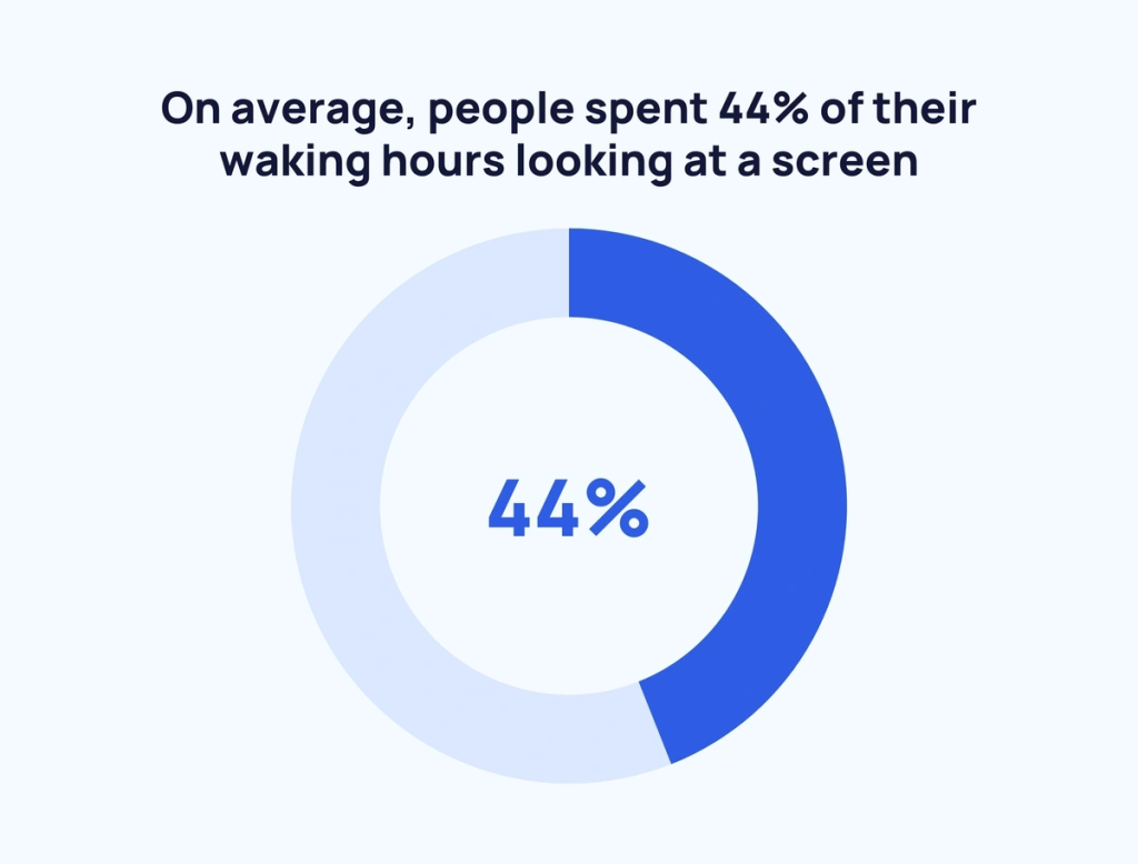
A recent statistic shows that on average people are spending 6 hours and 58 minutes before the screen per day which is already a lot and it’s growing almost every day.
If we deduct the sleep time, a person on average spends nearly half of his/her day in front of a screen. For some people, it can go up to 12 to 16 hours depending on their work.
For this increasing screen time, people are adapting dark modes so that they can spend more time before screens without hurting their eyes as the dark mode is believed to help reduce eye strain.
So using dark mode on websites might help keep visitors to your site for a longer period.
Increases visibility in low-light setup
Another benefit of dark mode design is expanded permeability, particularly, in a low-light arrangement. In obscurity mode, we can see the text and different things shown on the screen all the more plainly.
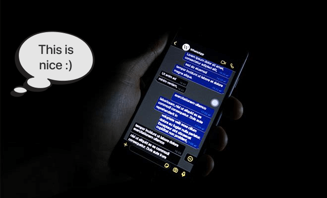
So, the dark mode can make your site easy to use on low light set-ups like night-time browsing and make surfing on your site a pleasure for users.
Saves the battery significantly

One of the significant annoyances for a few shoppers is that of low battery duration, or battery getting emptied out sooner than anticipated. A choice of utilizing the dim topic on the gadgets (whether PC or versatile) further develops the battery duration altogether.
This is particularly applicable to OLED screens as they can switch off black pixels when they are not in use.
A study done by Purdue University shows dark modes on OLED can save from 3% to 9% to up to 47% of battery life depending on the usage condition.
Better Aesthetics
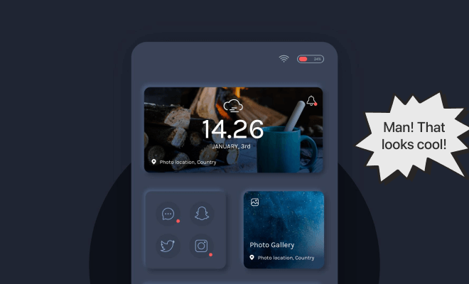
It certainly cannot be denied that the dark mode theme possesses a certain charisma that could be associated with boldness, formality, sophistication, mystery, strength, luxuriousness, etc.
Simply put, all of these traits are quite appealing and desirable, especially when it comes to marketing.
There is no chance of denying that, the dark mode can improve the perceived contrast of a user interface and enhance the overall aesthetics of a design, particularly for users with visual impairments.
Dark mode on websites can provide a cool and rich look if used correctly which can give a sense of credibility to your site visitors.
Helps improving focus
One more valuable impact of dark mode in web composition is the point at which you need to feature a particular sort of attention. Using bright colors in a dark mode setup, you can guide your audience to focus more on a part you want.
Dark mode on websites helps users to stay on the topic and get less distracted as dark mode doesn’t distract users with colors.
Take brands like Spotify and Netflix, for instance. They believe you should draw your eyes toward the bright and energetic collection of craftsmanship and video thumbnails.
Dark mode makes these thumbnails jump out with a certain goal in mind that light mode can’t.
Cons of using dark mode on websites
Where most people like dark modes, some people may still be skeptical about it. Some people may think it doesn’t look natural or have other arguments against it.
Here are the cons people should consider before implementing dark mode on websites.
Create a visual sense of less space
One of the few visual computerization best practices is having a huge whitespace in the plan.
This is for the basic explanation that having enough whitespace makes the screen look open and clear. With the dark mode feature, the visual feeling of this space is exhausted considerably.
Diminished emotional connect
Professional graphic designers understand that all colors carry individual emotional essences. So, when different colors show different bright emotions, the opposite can also be true.
Dark mode restricts putting out these emotions with color on your website. So, depending on the audience and the goal of your website, dark mode may not be a good choice.
For example, If your website is related to children and your target audience is mainly toddlers, you need to use colors on your website to make it interesting for them. In this case, using dark mode may not be a good choice to connect with them.
Dark mode looks unnatural
The human brain has a tendency to notice dark text over a light foundation. Because that is what we have been exposed to most of the time.
So, the human brain takes dark or colored components over light surfaces as a natural occurrence. Thus, when something in dark mode comes into our sight, the primary impression is that it is unnatural, or not common.
But being exposed to dark mode for quite some time, the brain is expected to adopt dark mode. Then dark mode can be more enjoyable to one.
Summary: Pros and cons of dark mode
Now let us summarise the pros and cons of dark mode side-by-side to make it easy for you:
- Dark mode helps to reduce eye strain in the long-term use of screens. But for some people, like those who suffer from myopia, dark mode can be difficult.
- Dark mode can give a better aesthetic or look to a website. But if not used correctly, it can look unpleasant and unnatural.
- Dark mode helps to improve focus. Also, it may demolish the emotional expression as there is less use of colors.
- One of the lucrative pros of the dark mode is, that it prolongs the battery life of a device. But it is mainly true for devices with OLED displays
Still, we can not deny the fact that dark mode is embraced by the majority of people. So if you want to set up dark mode on your website and your site is built on WordPress here is an easy way you can implement it effortlessly.
How to enable dark mode on your WordPress site?
WP Dark Mode is known to be the best WordPress Dark Mode plugin available in the WordPress repository right now.
With its amazing features, you can easily add a dark theme to your WordPress website. Let us dive deeper into how you can install the WP Dark Mode on your website.
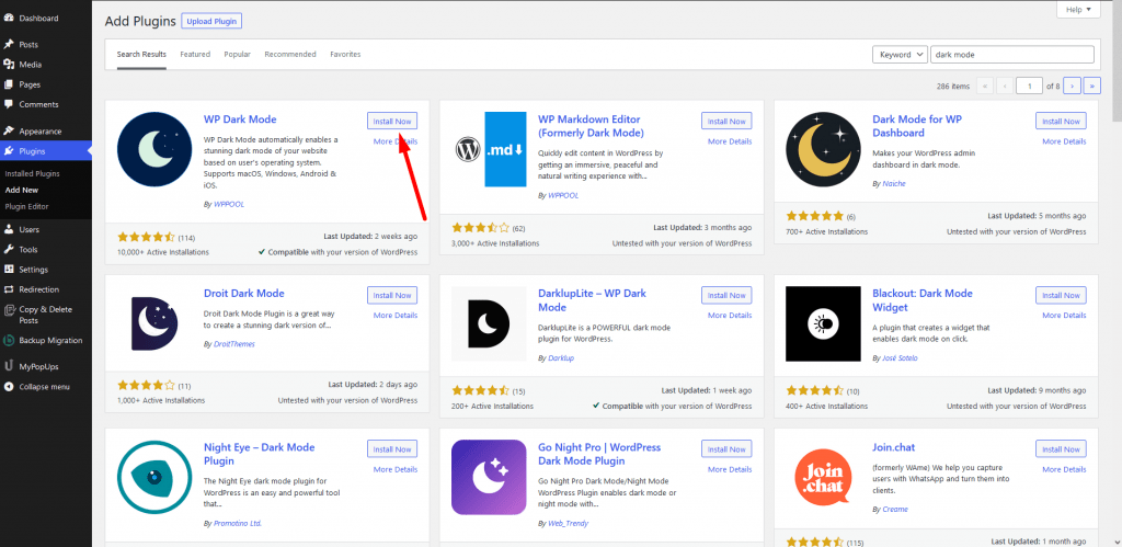
Activate the plugin from WP Admin–> Plugin–> Add New.
Go to the WP Dark Mode–> Settings page in your WordPress admin and click on the General Settings tab. You should be redirected there automatically.
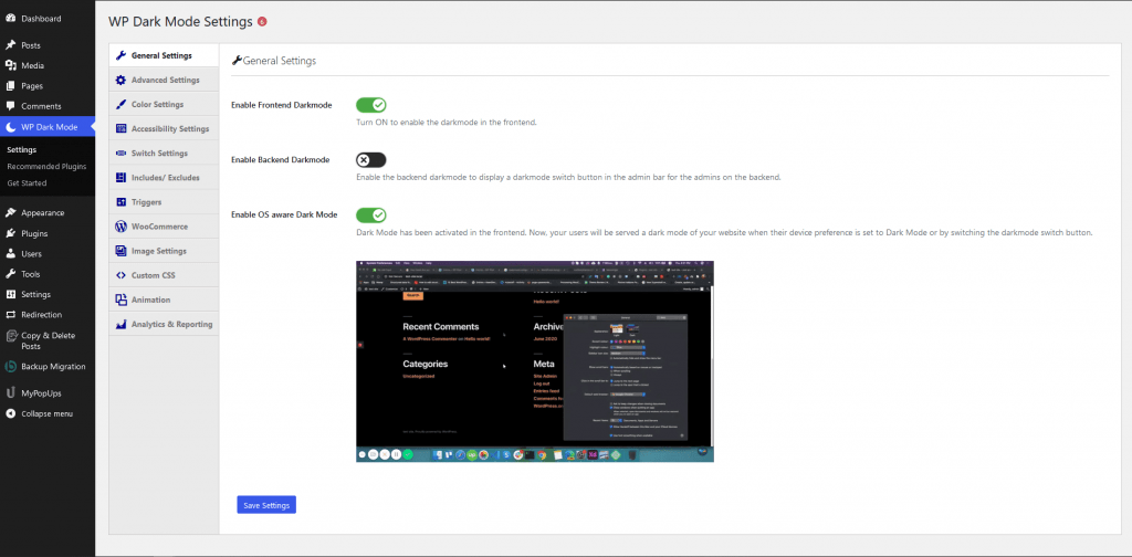
There are quite a few options for you.
If you enable the “Enable Frontend Darkmode” that will enable the Dark Mode on the frontend of your website.
The button ‘Show Floating Switch’ when switched on means users can switch their view of the site to dark mode at any time, even if they haven’t enabled a Dark Mode option on their device.
The ‘Enable OS aware Dark Mode has been switched on. This means that visitors will automatically see the dark mode version of your site once their device is set to Dark Mode.

When you visit your website, you will see the switch in the bottom right corner. Click it to instantly switch your site to dark mode on your device.
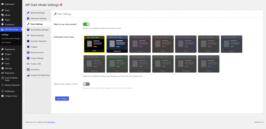
But wait, more customization options are available on the WP Dark Mode–> Settings » Color Settings. However, this is quite limited to the free plugin.
You can also customize the dark mode colors using the Style Settings tab:
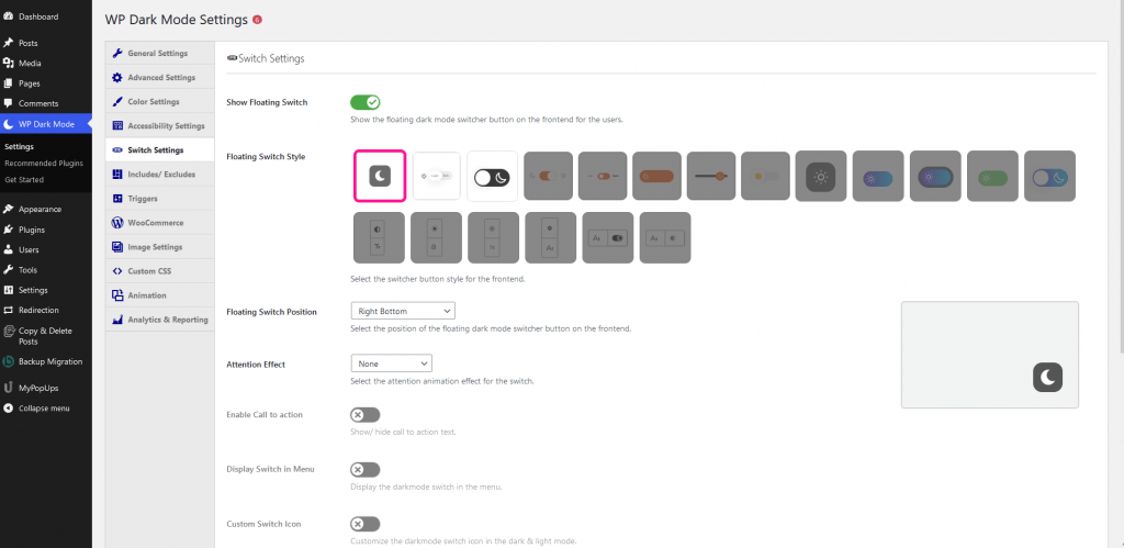
Click the Switch Settings tab to change the style of the floating switch:

With the free version of WP Dark Mode, you only get the first 3 floating switch styles, and the first 2 color presets to choose from.
Adding dark mode to the admin backend
What is surprising is that you can add dark mode to your admin dashboard as well.
WordPress comes with admin color schemes. But it is an important factor to reduce the white light coming from your screen. Fortunately, WP Dark Mode solves that issue.
You can easily add dark mode to your WordPress admin area for a more enjoyable user experience.
Navigate to the Settings » WP Dark Mode page and click on the General Settings tab. Then, toggle the ‘Enable Backend dark mode’ switch to the on position.
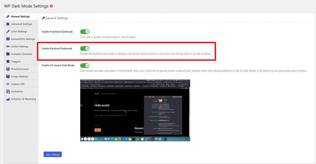
You will now see a new switch in the top bar of your admin area:
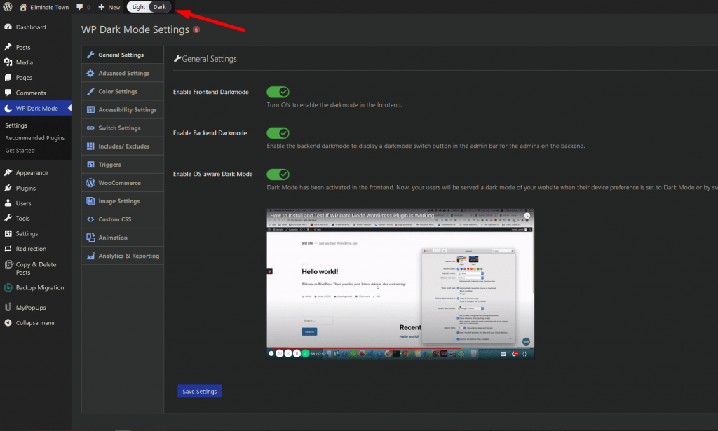
Simply click on this switch to instantly toggle your admin area to dark mode.
If your site has multiple WordPress users, each person can toggle the Dark Mode on and off as they prefer.
This is how you can easily add Dark Mode to your WordPress site.
Conclusion
We hope this answers your question about the pros and cons of using dark mode on websites. Also, now you know how to implement dark mode in your WordPress site.
Let us know about your experience with dark mode.
To learn more about WordPress dark mode, check our comprehensive guide.
FAQ
Is dark mode actually good for the eyes?
Though there is no solid evidence for dark mode being good for your eye health, dark mode is believed to reduce eye strain in case of long display time according to many user’s experiences.
Is there any effect of using dark mode on websites?
The dark mode is currently on trend. Many users prefer using dark mode instead of the conventional light mode. So, having a dark mode option on your website can help improve user experience. In some cases, it can also help in increasing customer retention rates.
Are there any disadvantages of having dark mode on websites?
There can be some. For example, if your product or service uses color to convey some message to your customers, the dark mode can eliminate that emotional essence. Keeping both, dark and light mode options on your website can help to reduce these disadvantages.
Is dark mode good or bad?
The dark mode is currently on trend. An increasing amount of people are preferring dark mode over light mode. Also, our screen time is increasing day by day and dark mode is believed to affect our eyes less in long-term use. So, if the dark mode doesn’t contradict your website or product theme, it is a better idea to have a dark mode option on your website.


