In a world where technology shapes our daily interactions, even the way we view our screens is evolving. Say hello to dark mode – an elegant and modern design trend that’s taken the digital world by storm. Now, imagine bringing the comfort and style of dark mode to your WordPress website, making it easier on the eyes and cooler to the touch.
In this complete guide to WordPress dark mode, we’ll unravel the mysteries of dark mode and show you how to seamlessly integrate it into your WordPress site. Whether you’re a curious content creator or a hands-on developer, we’ve got you covered.
Dive into the world of user-friendly design as we break down the steps to create websites that effortlessly switch between light and dark interfaces, offering a personalized experience for every visitor. We’ll walk you through simple tutorials, revealing the secrets to enabling dark mode on your WordPress site.
Let’s embark on this journey together, where we’ll shed light on the captivating world of dark mode for WordPress. With our help, you’ll not only enhance your site’s aesthetics but also offer a browsing experience that’s both contemporary and comfortable. Get ready to make your WordPress site shine, day or night!
How does dark mode work?
How does our dark mode actually work? Why does the text look more dominant on a dark background? Let’s get into more detail.
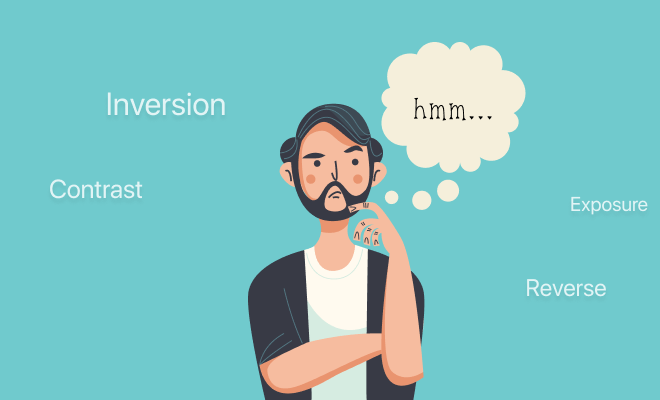
The dark mode works by reversing the default light-on-dark color scheme of most screens. Instead of dark text on a light background, dark mode displays light text on a dark background. This reduces the amount of light emitted by the screen, which can be helpful for reducing eye strain and fatigue, especially in low-light conditions.
- The first step is to invert the colors of the screen. This is done by swapping the foreground and background colors. For example, if the default text color is black, it will be changed to white in dark mode. The default background color, which is usually white, will be changed to black.
- Once the colors have been inverted, the contrast between the text and background colors is adjusted to ensure that the text is still readable. This is important because too much contrast can make the text difficult to read, while too little contrast can make it hard to see the text against the background.
- Finally, any images or icons on the screen are also inverted. This is done to maintain the overall consistency of the dark mode theme.
What are the benefits of using dark mode in WordPress (WordPress dark mode)?
Using a dark mode in WordPress can offer several benefits for both website administrators and users. The dark mode is particularly useful for those who prefer a darker color scheme, especially in low-light environments. Here are some benefits of using dark mode in WordPress:
- More visibility: Dark mode can provide better contrast and visibility for users with certain visual impairments. The higher contrast between text and background can make content more legible.
- Better user experience: Offering a dark mode option enhances the overall user experience by catering to different preferences and creating a visually pleasing interface.
- More aesthetic appeal: Dark mode can give your website a modern and sophisticated look, attracting users who prefer this style. It can also make certain design elements stand out more effectively.
- Good for branding: If your brand aligns with a darker color scheme, incorporating dark mode can maintain brand consistency across your website.
- Higher cross-platform consistency: If users have dark mode enabled on their devices or operating systems, your website will automatically adapt, providing a consistent experience across different platforms.
It’s worth noting that dark mode implementation should be done thoughtfully to ensure readability, accessibility, and a positive user experience. If you’re using WordPress, you might consider using plugins or themes that provide built-in support for dark mode or offer easy customization options for implementing it. Always test dark mode thoroughly to ensure that it works well with your website’s design and content.
Also, big companies are also using dark mode in their app and in their website as well.
For example, Apple has been a big proponent of dark mode, and it is available on all of its devices, including the iPhone, iPad, Mac, and Apple Watch.
Google also has dark mode available on most of its products, including Android, Chrome, Gmail, and Google Maps. Google says that dark mode can help to improve battery life and make it easier to read text in low-light conditions.
Netflix introduced dark mode in 2017, and it is now available on the desktop website, mobile app, and TV apps. Netflix says that dark mode can help to reduce eye strain and make it easier to watch movies and TV shows in low-light conditions.
Why dark mode is better?
Dark mode offers several advantages that make it a preferred choice for many users. Here are some reasons why dark mode is considered better in certain contexts:
- Reduces eye strain: Dark mode reduces the amount of bright light emitted by screens, which can alleviate eye strain and fatigue, especially during extended periods of device use.
- Better for low-light environments: Dark mode is particularly effective in low-light conditions, such as dimly lit rooms or nighttime use, where a bright screen can be overwhelming and disruptive.
- Improves readability: The contrast between text and background in dark mode often results in improved readability, making it easier for users to consume content, especially for individuals with visual impairments.
- Enhances focus: The muted and subdued colors in dark mode create a focused and distraction-free environment, making it ideal for tasks that require concentration, such as writing or coding.
- Accessibility & personalization: Dark mode improves accessibility for users with certain visual impairments by providing higher contrast and making content easier to perceive. It also gives users the freedom to personalize their digital experience according to their preferences, promoting a more user-centric approach to design.
It’s important to note that while dark mode has many advantages, its effectiveness can vary based on individual preferences, lighting conditions, and the type of content being consumed. Implementing dark mode should be done thoughtfully, considering design principles, readability, and accessibility to ensure a positive user experience for all users.
Are dark mode websites more popular than light mode?
Dark mode websites are becoming increasingly popular. According to a study by Google, in 2022, over 82% of Android users had enabled dark mode on their smartphones. This trend is also evident in the web design world, with many popular websites now offering dark mode options.
There are several reasons why dark mode websites are becoming more popular. First, dark mode can be easier on the eyes, especially in low-light conditions. This is because dark mode reduces the amount of bright light emitted from screens, which can cause eye strain and fatigue.
Secondly, the dark mode can be more visually appealing to some people. This is because dark mode can create a more calming and relaxing atmosphere. Third, dark mode can be more battery-efficient on devices with OLED screens. This is because OLED screens only light up the pixels that are needed to display an image, so dark mode uses less power.
Of course, not everyone prefers dark mode. Some people find it hard to read text on a dark background. Others simply prefer the look of light mode. However, the trend towards dark mode is clear, and it is likely that more and more websites will offer dark mode options in the future.
Here are some of the benefits of using dark mode on websites:
- Reduced eye strain and fatigue, especially in low-light conditions.
- More visually appealing to some people.
- More battery-efficient on devices with OLED screens.
- If you are considering using dark mode on your website, I recommend doing some testing to see if it is a good fit for your users. You can also use a tool like Google Analytics to track the number of users who enable dark mode on your website.
Read: 10 reasons to use a night mode plugin on your WordPress site
How to add dark mode in WordPress
If you are using a content management system (CMS) like WordPress adding dark mode to your website is child’s play. Simply install and activate the WP Dark Mode plugin from your WordPress dashboard to enable a dark mode version of your website to visitors. This plugin also allows a time-based dark mode feature to let you decide exactly when you want the dark theme on your website.
Read the following guides to learn how to enable dark mode on WordPress based on your use cases:
- How to activate dark mode in Divi Theme in 5 easy steps
- How to use dark mode on Elementor Hello theme
- How to enable dark mode for eCommerce
- Enabling dark mode for WooCommerce stores in 2023
What are some popular dark mode features?
Dark mode features enhance the user experience by providing a more comfortable and visually appealing interface in low-light environments. Here are some popular dark mode features commonly found in websites, apps, and operating systems:
UI Color Scheme: Dark mode replaces the traditional light background with a dark or black background, and adjusts the color scheme of UI elements like buttons, text, and icons to maintain readability and visual contrast.
Text Readability: Dark mode often employs lighter text colors to ensure readability against the dark background. This includes adjusting font colors for body text, headings, and other content.
Reduced Brightness: Dark mode reduces the overall brightness of the interface, making it easier on the eyes in low-light conditions. This can help prevent eye strain and improve comfort.
Contrast Enhancements: Designers often fine-tune the contrast ratios between text and background to ensure legibility while maintaining a visually pleasing appearance.
Icon and Button Styles: Icons and buttons are adjusted to ensure they stand out against the dark background. They might use different colors, styles, or visual effects to maintain their visibility.
Background Images: Dark mode websites might offer different background images optimized for the dark color scheme to create a seamless and immersive experience.
Auto-dark mode: Some websites, apps, and operating systems offer the option for automatic dark mode activation based on the time of day. This ensures that users don’t need to manually switch between modes.
Toggle Switch: Users often have the option to switch between dark and light modes using a toggle switch, which can be located in the user interface or in settings.
Navigation and Menus: Dark mode navigation menus and sidebars can use different color treatments to ensure ease of navigation while maintaining the overall dark aesthetic.
Animation Effects: Subtle animations, hover effects, and transitions can be adjusted to fit the dark mode design, enhancing the user experience without overwhelming the eyes.
Code Syntax Highlighting: For websites that involve coding or technical content, dark mode can include syntax highlighting that improves code legibility against a dark background.
Customization Options: Some platforms allow users to customize aspects of the dark mode, such as choosing accent colors or adjusting the level of darkness to their preference.
Accessibility Considerations: Designers might include options to adjust text size, font choices, and other accessibility features to accommodate different user needs.
Consistency Across Platforms: Popular platforms (websites, apps, and operating systems) aim for consistency by providing a uniform dark mode experience across different devices and interfaces.
It’s important to implement dark mode features thoughtfully, considering factors such as accessibility, usability, and the overall user experience. Balancing aesthetics with functionality ensures that users can enjoy the benefits of dark mode without sacrificing readability or usability.
What are some ongoing dark mode trends?
The dark mode trend is still going strong in 2023, and there are several ongoing trends that are shaping the way dark mode is used on websites.
One trend is the use of more dynamic dark mode designs. In the past, dark mode was often a simple inversion of the light mode design, with white text on a black background. However, more and more websites are now using more dynamic dark mode designs that use different colors and shades of gray to create a more visually appealing and user-friendly experience.
Another trend is the use of dark mode on more devices and platforms. In the past, dark mode was mostly limited to smartphones and laptops. However, more and more TVs, tablets, and other devices now offer dark mode options. This is making dark mode more accessible to a wider range of users.
Finally, dark mode is becoming more integrated with other features on websites. For example, some websites are now using dark mode to automatically adjust the color scheme of their website based on the time of day or the user’s ambient lighting conditions. This is making dark mode more convenient and user-friendly.
Here are some of the ongoing dark mode trends that we expect to see in 2023 and beyond:
- More dynamic dark mode designs
- Dark mode on more devices and platforms
- Dark mode integrated with other features on websites
- Dark mode becoming the default mode on some websites
- More research into the benefits of dark mode
- Dark mode becoming more mainstream
Does dark mode improve conversion?
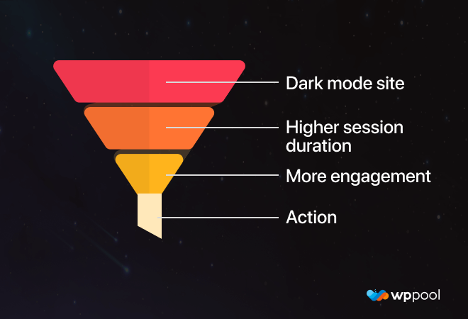
There is some evidence to suggest that dark mode can improve conversion rates on websites. A study by Nielsen Norman Group found that users who used dark mode on a website spent an average of 10% more time on the website and were 12% more likely to convert.
There are a few reasons why dark mode may improve conversion rates. First, dark mode can be easier on the eyes, which can lead to users spending more time on the website. Second, dark mode can create a more calming and relaxing atmosphere, which can make users more receptive to calls to action. Third, dark mode can be more visually appealing to some people, which can also lead to higher conversion rates.
However, it is important to note that not everyone prefers dark mode. Some people find it difficult to read text on a dark background, and others simply prefer the look of light mode. Therefore, it is important to test dark mode on your website to see if it is a good fit for your users.
If you are considering using dark mode on your website, I recommend doing the following:
Test dark mode on a small group of users to see if they prefer it to light mode.
Track the time spent on your website and conversion rates with and without dark mode enabled.
Use a tool like Google Analytics to track the number of users who enable dark mode on your website.
If you find that dark mode improves conversion rates on your website, then you can consider making it the default mode. However, if you find that dark mode does not improve conversion rates, then you may want to leave it as an optional feature.
Read: Why you should use Dark Mode to reduce bounce rates & increase conversion rate
Dark mode implementation strategies and best practices
Implementing dark mode effectively requires careful consideration of design, readability, and user experience. Here are some strategies and best practices to ensure a successful dark mode implementation:
Maintain readability:
Ensure that text remains easily readable against the dark background. Use light-colored text that offers sufficient contrast. Test different text sizes and fonts to find the optimal balance between readability and aesthetics.
High contrast elements:
Icons, buttons, and important UI elements should stand out prominently. Use contrasting colors for interactive elements to guide users and maintain usability.
Pick color wisely:
Choose a color palette that complements the dark mode aesthetic. Test colors to ensure they don’t cause discomfort or confusion. Avoid using harsh and bright colors that might be jarring in a dark environment.
Maintain consistency across themes:
If your website offers both light and dark modes, maintain consistency in branding, layout, and content between the two modes. Users should easily recognize your website, regardless of the mode they choose.
Focus on content legibility:
Prioritize content legibility by ensuring that background colors, text colors, and font sizes work well together. Avoid excessive contrast that might strain the eyes.
Customization options:
Consider providing customization options within the dark mode. Allow users to adjust contrast, font size, and other settings to cater to individual preferences and needs.
Automatic detection:
Implement automatic detection based on device settings or time of day to seamlessly switch between light and dark modes. Users appreciate this convenience.
Accessibility considerations:
Follow accessibility guidelines to ensure that your dark mode is usable for all users. Test for color contrast, ensure proper keyboard navigation, and provide alternative text for images.
Test with real users:
Conduct user testing with real users in different environments to gather feedback on the dark mode implementation. Adjust based on their preferences and insights.
Optimize images:
If your website uses images, ensure they’re optimized for dark mode. Bright images might need adjustments to maintain consistency with the overall color scheme.
Educational prompts:
If you’re introducing dark mode to existing users, offer educational prompts or tooltips to inform them about the new feature and how to toggle between modes.
Cross-browser and cross-device compatibility:
Test your dark mode implementation across various browsers, devices, and operating systems to ensure consistent performance and appearance.
Regular updates:
As design trends evolve and user preferences change, consider regularly updating your dark mode implementation to stay current and aligned with user expectations.
Remember that dark mode should enhance user experience, comfort, and engagement. Prioritize readability, aesthetics, and usability to create a dark mode that adds value to your website while catering to a diverse range of user preferences.
Further learning
The rise of dark mode has brought a new dimension to user interface design, catering to the evolving preferences and needs of digital users. This sophisticated design trend has found its place in websites, apps, and operating systems, offering benefits beyond just aesthetics. With reduced eye strain, enhanced readability, and improved focus, dark mode is more than a mere color palette shift – it’s a user-centric approach that prioritizes comfort and usability.
We have several additional resources to help you learn more tips and tricks on utilizing dark mode to its best potential.
- Pros and Cons of Having Dark Mode on Your Website
- How to enable Dark Mode on Elementor websites in 2023
- Why Dark Mode got popular in the tech world in 2023?
- 7 best practices in web design for a higher conversion rate
As we mentioned above, getting the best dark mode experience requires the best dark mode plugin. And WP Dark Mode is the best plugin to achieve that goal. Download WP Dark Mode for free today and start your dark mode journey in style!



Add your first comment to this post